I never opened my own product analytics. So I rebuilt it from scratch. Now it's public.
I rebuilt my product's analytics in an afternoon with PostHog and Claude Code, then made the dashboard public. The one-metric method, the KPIs, and how to build your own.
You have analytics installed. It takes 2 minutes.
But when was the last time you opened a dashboard? The last time one actually helped you take action?
I'm not judging. I had Google Search Console, PostHog, Stripe, and Cal all quietly collecting data on my product, and if you'd asked me "how's it going?", I wanted one clear answer in a single glance. Getting it meant signing into five tools and connecting the dots myself.
Then I opened AEO Copilot to a public beta. Free access, for everyone, with a promise to myself: learn fast enough during this phase to actually deliver value to the people using it. When you make that promise, "I'll check the numbers later" stops being available.
And if you don't, you just waste money.
So I did for my own app what I do for clients. I built one dashboard that answers one question: is this working? Then I made the whole thing public.
Analytics should work for you, not the other way around
That's the belief everything here runs on.
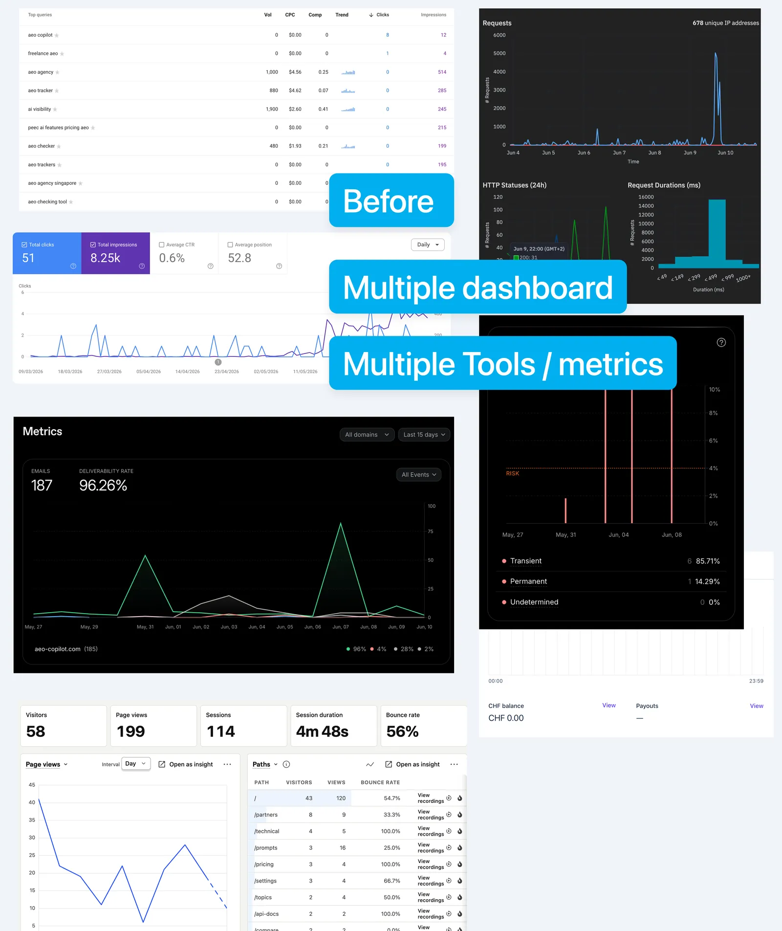
Most setups do the opposite. You install the tools, turn on automatic tracking, and end up with hundreds of metrics, a dozen dashboards, and no idea which number to look at on a Monday morning. So you look at none of them. Tracking everything is how you end up monitoring nothing.
The job of analytics isn't to record what happened. It's to help you decide what to do next. If a number won't change a decision, it's noise wearing a suit.
Real analytics people don't care about every metric on the dashboard. They can answer your questions with data in seconds.
When I work with my clients, we never start with the tool. We start with the goal, then work backwards to the smallest set of numbers that tells us whether we're moving toward it. I'd just never done it for my own product. The beta gave me the reason.
Start with the goal, not the metric
My goal for the beta is easy to say and hard to fake: people use AEO Copilot to see whether their brand shows up in AI answers, and they keep coming back because it's useful.
So the one number can't be signups. Signups measure my landing page, not my product. Someone can sign up, look around once, never return, and the signup chart still ticks up and makes me feel good. That's the trap. Another vanity metric in disguise.
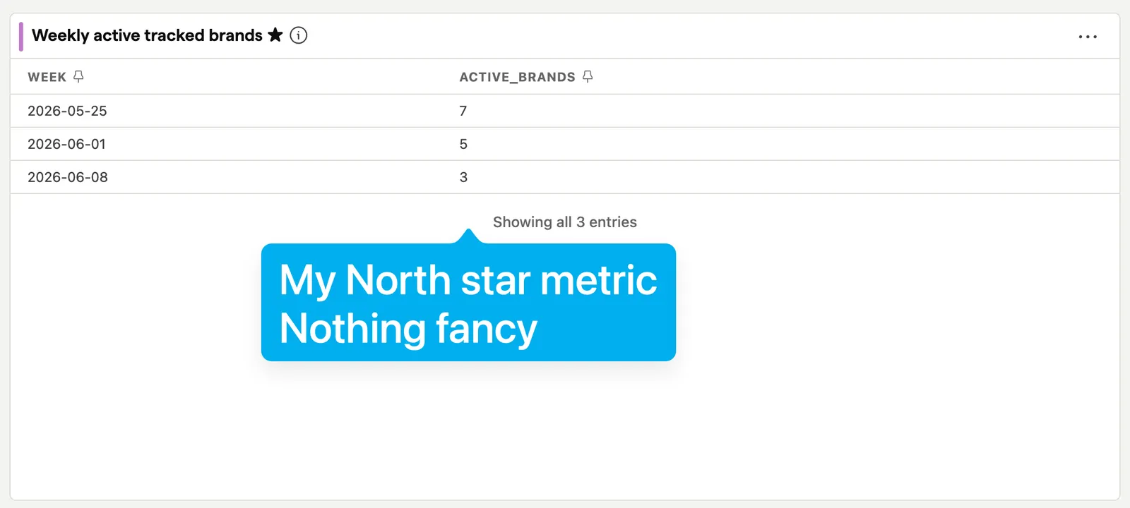
The number I picked for AEO Copilot is weekly active tracked brands. A brand that keeps getting tracked, week after week, is a brand getting value. It's the smallest unit of "this is working" I could find. If that line grows, the product is doing its job. If it's flat while signups climb, I have a problem dressed up as success.
This is the part most people skip. Your one metric should be the thing that's only true when you're actually delivering value, not the thing that's easiest to count. Ask it this way: if every other chart vanished, which single number would still tell you whether the product deserves to exist? Build everything around that answer.
What about revenue? Surely that should be the north star. I don't think so. Revenue counts how many people pay, not how many get value. People keep paying for things they've stopped using, and plenty of happy users haven't paid yet. In my case revenue is a KPI I watch closely, but it isn't the north star. The brand getting tracked every week comes first. The money follows that, not the other way around.
The KPIs are early warnings around the one number
The north star tells you if you're winning. It doesn't tell you where you're losing. For that, I picked one question per stage of the journey, and a couple of metrics that answer it.
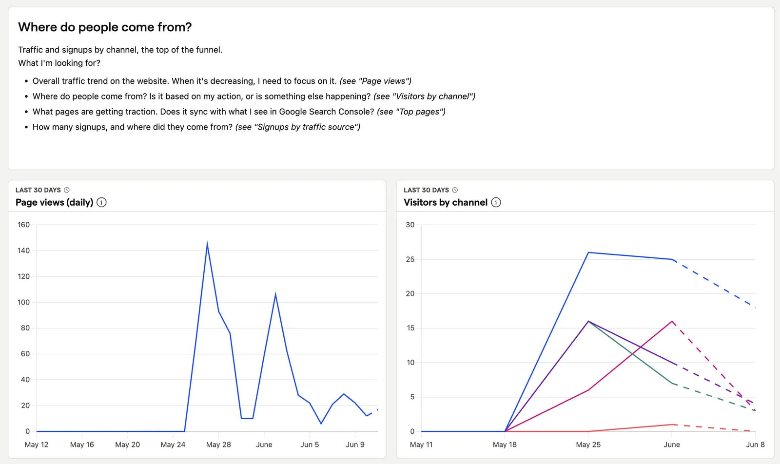
- Where do people come from? Discovery. I watch clicks from Google Search Console on the handful of queries that actually matter for AI visibility, not total impressions. Impressions feel nice and decide nothing.
- What happens before they sign up? Acquisition. New signups, read against the traffic that produced them, never on their own.
- What happens after they sign up? Activation, the one most people miss. For me it's a brand getting tracked for the first time. A signup who never tracks a brand never saw what they came for.
- Do they come back? Retention, where my north star lives: weekly active tracked brands. If acquisition looks healthy and this stays flat, I'm pouring users into a bucket with a hole in it.
- Do they pay? Revenue. Conversion to a paid plan, and whether it sticks. Money is the most honest signal that the value was real.
Five questions, a handful of numbers. Together they tell me whether I'm winning, and when I'm not, which part to fix first.
A number you can't trust is worse than no number
This is the part people always skip. Picking the right metric is useless if the metric lies to you. Or worse, if you can't trust it.
I caught my own dashboard doing it. Subscription renewals were being counted the same as new paid customers. Every billing cycle, the same people got counted again, and my "new paying users" line quietly inflated. A number that climbs for the wrong reason is more dangerous than a number you don't have, because you'll make confident decisions on a lie.
Here's how I build trust in a number:
- Go straight to the source. Money comes from Stripe, behavior from the app itself. Never from a single fragile place that can drop events or count them twice.
- Double-check anything that surprises you. A number that jumps is a question, not an answer, until you've seen the events behind it.
- Treat it as never finished. When you catch a metric lying, like the renewals above, fix the definition and keep going. Trust is maintained, not installed.
Before you trust a chart, run the boring test. Take one number and go find the real events behind it. If you can't explain how a metric is counted, you don't have a metric.
Building custom analytics used to be crazy hard
Here's what would have stopped me a few years ago. Getting the data flowing is the hard part of any analytics project. Someone has to go into the product and the website and set up tracking for every event you care about, then turn that raw data into charts that answer a real question. That's two specialist jobs, or one expensive hire, or a quarter of waiting.
Adding events across the app and the website took me two hours. Another two to build the dashboard and the insights.
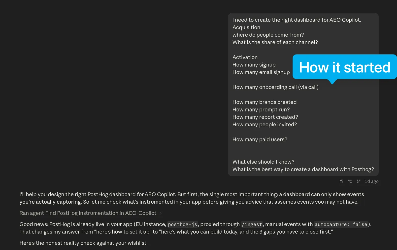
I used Claude Code, which works right inside my product, so adding the tracking wasn't a separate project. I described the journey in plain language. Track when someone signs up. Track when a brand gets tracked for the first time. Track when a report runs. Track when a plan gets paid.
My analytics tool was PostHog, on the free plan. Claude Code read PostHog's own documentation to instrument each event, then used the PostHog API to build the dashboard. I didn't write tracking code or click through chart builders. I described what I wanted and reviewed what came back.
I finished by connecting the other sources: Search Console for SEO, Cal for onboarding calls, and Stripe for revenue.
I didn't expect it to be that smooth. The little friction I faced genuinely surprised me.
If you want to do this yourself, the order matters more than the tools:
Write down your one north star metric and your stage questions first. On paper, before you touch any tool. The whole build is just making those numbers visible.
Prompt to start with: "Here's what my product does and who it's for: [describe it]. Help me pick one north-star metric that only rises when a user gets real value, not when they just sign up. Push back on my first answer."
Map the user journey end to end and mark the few events someone has to hit along the way. Those events are the moments that matter.
Point Claude Code at your product and ask it, in plain language, to track each of those moments. Name the moment, not the code.
Send those events to PostHog, and connect the sources you already pay for.
Build one view per question, and one screen that puts the north star on top.
Run the boring test on each number before you trust it.
Why I put the numbers where you can see them
I could have kept this dashboard to myself. I made it public on purpose, for three reasons.
- It keeps me honest. When the numbers are in the open, my decisions have to match them. I can't quietly tell a nicer story than the data supports.
- It's fair to the people in the beta. They're giving me their time and their trust before the product is finished. The least I can do is show them the same reality I'm looking at.
- It's proof. Building in public usually means sharing the wins. I want to show the whole thing: the real numbers behind a product still finding its feet, and the fact that you don't need a rocket scientist or a data team to watch them.
You can see mine here: the live dashboard.
Open your own analytics right now. Not to admire it. To ask it one question: what single number proves this product is working?
If you can answer in five seconds, good. Now go check the number is telling the truth.
If you can't, that was never a tracking problem. It's a clarity problem. And the setup that used to stand between you and the answer takes an afternoon now.